TalkTimer app for WP7
I have been part of the Toastmasters for Techies group in Grand Rapids since starting with the group about a year ago. In fact I am Vice President in charge of Public Relations, so let me mention now that everyone should attend if they communicate or present ideas in their current job (which is everyone by the way).
One of the tasks at Toastmasters is the Timer – this person typically has a stop watch and a set of cards that are Green, Yellow, and Red. If a particular talk is supposed to be 5 to 7 minutes long, the timer waits until the minimum time (5:00) and then shows the green card (letting the speaker know they have reached the minimum), then at the mid-point of the time (6:00) they show the yellow card (wrap it up), and at (7:00) the red card comes out and you technically have 30 seconds to wrap up (if not, we’re just learning). Another important point about this position is that you need to record the time for each person during the meeting and report the times at the and of the meeting.
So I wanted to get a quick app done for the Windows Phone 7 app store and I picked this need for my first app. It is called TalkTimer, it’s free, and has about 250 downloads in the first week (not amazing, but a start – getting some good feedback for a few new features). Here is the app in a nutshell.
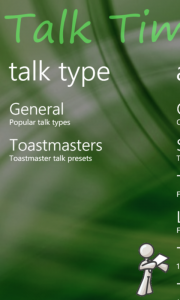
Pick your type of talk – wanted to include Lightening talks, TEDx talks, 5×5 and other formats in addition to Toastmasters
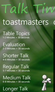
Pick the type of talk (which automatically has the minimum, mid-point, and maximum length)
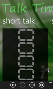
A nifty digital timer awaits your pushing the “start” arrow.
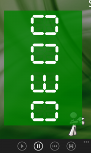
The countdown timer turns green, yellow, red when your time is running out (only counts the full minutes before the last 30 to minimize distractions).
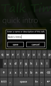
Then a you can save the result to a log and list, by ironically clicking an icon that looks like a floppy disk (“What’s a floppy disk daddy?”)
That’s all it does, but it does do it pretty well.
I’m adapting the timer to a Circuit Training app that I may or may not release – there seems to be a need, but getting an app from fun prototype to production-ready is a bit more time than I have free in the next few weeks.
Some interesting stories about getting it released and tested. The only real hitch was that dialog box in the above image – it didn’t like the “light background” option that the phone user can set if they like white in the background instead of black (for some reason). All the other controls handled it well. I had to do a couple backflips in Expression Blend to create a nice template that ignored the color settings and always presented the same – which is a fine resolution.
A good learning experience and a helpful app – now I just need to plan my next speech. Thinking of bringing back out the Dreyfus Model materials – that might be fun to present.

